
Improving On Traditional Release Burndown Charts
I want to use this month's blog posting to introduce a type of burndown (and burnup) chart that I find useful. I've been drawing this style of burndown chart for years and have coached many of my clients to do the same. Unfortunately, we've had to draw it either by hand or in tools like Visio and OmniGraffle because the agile tool vendors haven't (to my knowledge) hit on this idea yet. I'm hopeful that some of them will see this posting, decide this is a good visualization, and incorporate it into their products. The classic Scrum release burndown chart is good at showing whether a team will finish "on time" as can be seen in the following example burndown chart:
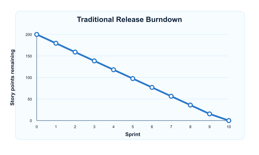
A release burndown chart such as this one shows sprints on the horizontal axis and can show story points or ideal days on the vertical. It is updated once per sprint to show the team's net progress that sprint. A team's net progress is the amount of work they finished net of any changes in scope. So a team that completes 30 points of work but that has 10 points added to their product backlog will show net progress of 20. But while a traditional release burndown chart excels at showing whether a team is on pace to finishing on time, it is not very good at showing what will be included in that "on time" delivery.
To see this, imagine two teams that each start with 200 story points of work. The first team finishes twenty points of work for each of ten sprints. The second team is incompetent and rather than completing twenty points each sprint they drop twenty points of scope each sprint. The two burndown charts will be identical--perfect lines descending over ten sprints from 200 to 0. At one level this is OK: the burndown chart shows whether a team will be finished (or by when the will be finished). The simplicity of the standard release burndown chart has much in its favor. It isn't hard, though, to extend a release burndown chart to also show what will be in the product by the final sprint. Look at the next figure, which is a hypothetical example of an eCommerce product.
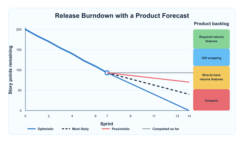
In this figure, you can see the burndown is tracked in the normal way through the end of the current sprint, the seventh. The company desires to release this product after the fourteenth two-week sprint. The right side of the burndown chart shows the team's product backlog with the highest priority theme ("Returns") at the top. This top block represents some "must-have" user stories related to returning purchased items. Below that is a theme for gift wrapping purchased items, followed by some "nice to have" aspects of returning items. At the bottom right is the Coupons theme. Extending out from the team's current position at the end of the seventh sprint are four lines. These lines represent the following:
-
The team's current position, drawn as a horizontal line from the current burndown position over to the product backlog. This tells us what is in the product so far. We can see that the mandatory return user stories and the gift wrap user stories are finished and that the team is partially into the nice-to-have return user stories.
-
A black, dashed line showing the team's most likely finish. This is the first of three trend lines meant to show the likely range of work the team might deliver. To draw a team's most likely finish use the team's long-term average velocity. You can define "long-term average velocity" in whatever way you want but my preference is to use the average velocity of the last 8-12 sprints. Pick the number of historical sprints that is most suitable for your team based on how long the sprints are and how long the team stays together.
3. A pessimistic forecast of the amount of functionality that may be delivered. For agile planning and forecasting, I recommend using a team's worst-case but likely velocity. Calculate this by averaging the worst three or so velocities chosen among the same 8-12 iterations you looked back at to determine the team's long-term average velocity.
- An optimistic forecast of the amount of functionality that may be delivered. Calculate this in the same was as in the pessimistic case but use the three (or so) best velocities of the team.
The figures in this blog are static images I've cut from a presentation. If you apply this technique for your team, the backlog items on the right should be clickable, allowing users to drill down into a product backlog theme to see specifically which items (typically user stories) make up the backlog. By producing a single chart that shows both a team's rate of progress (its burndown) and the product backlog, we have a single visualization that shows both when a team is likely to finish and what features will be in the product by that time. This makes is easier for product owners to make scope vs. schedule tradeoff decisions. Check back in a few weeks when I'll show an even more powerful technique for visualizing large product backlogs.

Agile Planning And Forecasting
FeaturedAgile teams plan at many levels. This guide focuses on one of the hardest: milestone planning and forecasting across multiple sprints.

Estimating & Planning in Agile: A 2026 Field Guide
FeaturedShare a practical 2026 field guide to agile estimating and planning, with current guidance for making useful forecasts without false certainty. Download a PDF of this you can share.

Sprint Backlog
FeaturedThe Sprint Backlog is the Developers’ plan for achieving the Sprint Goal. It includes the Sprint Goal, the Product Backlog items selected for the sprint, and the work Developers believe is needed to create a done…
Why I Don't Use Story Points for Sprint Planning
I don't use story points for sprint planning because story points are a useful long-term measure. They are not useful in the short-term.

It’s Not What You Do. It’s What You Do Next.
Recover from mistakes by focusing on the next useful action.
Managing Risk on Agile Projects with the Risk Burndown Chart
It is possible for risk management and agile project management to coexist on projects that need to explicitly do so.
7 Ways to Get the Best Estimates of Story Size
Agile teams often struggle to estimate product backlog items. Here are 7 ways to make solid improvements.

Should Story Points Be Assigned to a Bug Fixing Story?
My usual recommendation is to assign points to bug fixing the agile defects. This really achieves the best of both worlds.


Estimates on Split Stories Do Not Need to Equal the Original
Understand why split story estimates do not need to add up to the original.
200 User Story Examples
Explore more than 200 user stories from three real product backlogs Mike Cohn created, and use them as practical examples for your own team. See user stories Mike Cohn wrote as part of several real product backlogs.

What Are Agile Story Points?
Understand what story points measure and why they are often misunderstood.

Plan Visualizer Tool: Agile Forecasting for Accurate Plans
Show stakeholders how much the team can accomplish, by when, with the MGS Essentials Plan Visualizer.

Four Reasons Agile Teams Estimate Product Backlog Items
Estimating product backlog items provides benefits beyond predicting when a project will be finished.

Epics, Features and User Stories
Clarify the difference between epics, features, and user stories without getting stuck on labels.

Nine Questions Scrum Masters and Product Owners Should Be Asking
Use better questions to improve collaboration, decision-making, and team ownership.
When Should We Estimate the Product Backlog
Estimate backlog items at the right time and level of detail.

Is It Dangerous to Calculate the Cost per Point?
Calculating a cost per story point comes with risks. Here's what you need to know.


Can There Be Too Much Transparency?
An agile team should provide visibility into its work. But not all work should be equally transparent.